The Application State is used to communicate status, errors, and zero/empty states.
Usage
When to use
- When an application encounters an issue or error during its operation.
- When emphasis is needed on the creation of a new object within a null state.
When not to use
- When the absence of content is expected and does not require an explanation to the user.
- When there is a clear and intuitive way to add or populate content.
Alignment
The Application State supports two alignment options: left (default) and center. The alignment affects text alignment, action placement/alignment in the footer, and media placement; however, it does not change the default page alignment.
Left alignment

Center alignment

Media
The media slot is used to add illustrations to increase the visual impact of the Application State.
This provides additional visual prominence while also elevating the brand experience. If the illustration has a circular container, we recommend setting the alignment to center.

Header
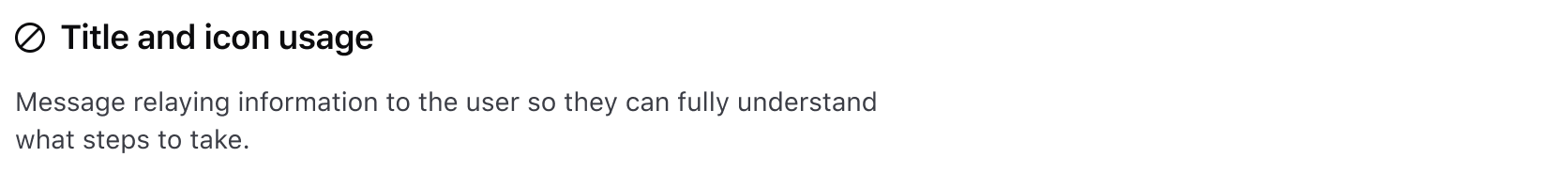
Icon
When set, the icon is displayed side by side with the title.
This is commonly used when displaying an error state for application failures. The icon must always be accompanied by a title.
Title
The title should be short and provide a clear and concise message.
Error code
If enabled and available, an error code will be shown, providing additional information associated with the title.
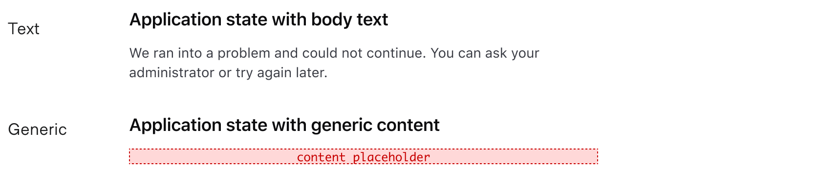
Body
Focus on relevant information and avoid unnecessary details. If there is an error, include suggestions or guidance for how the user can resolve the issue, if possible. If no objects are found (zero/empty state), provide a brief explanation on how creating this new object will benefit the user.
The body allows for two types of content: text and generic.
Footer
The Application State supports up to three actions, including Dropdown, Standalone Link, and Button components. Use footer actions to help users resolve errors or access issues with actionable steps.

Using buttons or links
Buttons, along with links, are the most common actions used in the footer. Buttons are more often used in empty state contexts because they provide high visibility for the primary action on the page. Links are more common in error state contexts as a means to provide a solution to the error they encountered.
Read more about when to use Buttons and Links.
When there is an empty state that occupies the majority of the page, do not display two similar actions in different areas of the UI. In this example, there is a primary button in the Page Header and in the Application State.
Instead, use the Application State as the only means of drawing attention to the primary action.
Using dropdowns
Dropdowns can be used as actions in the footer in rare cases. Limit dropdowns to one per Application State.

Width constraints
The Application State’s content has a max width of 480 pixels. This is done for better readability, ensuring that the max character count is close to 70 characters per line.
Examples
Here are some common use cases for the Application State, however, it is not limited to just these two examples.
Error state
Error states are used when the application encounters an issue or error during its operation. It shows the associated error code, icon, messages, and actions to help users find a solution.

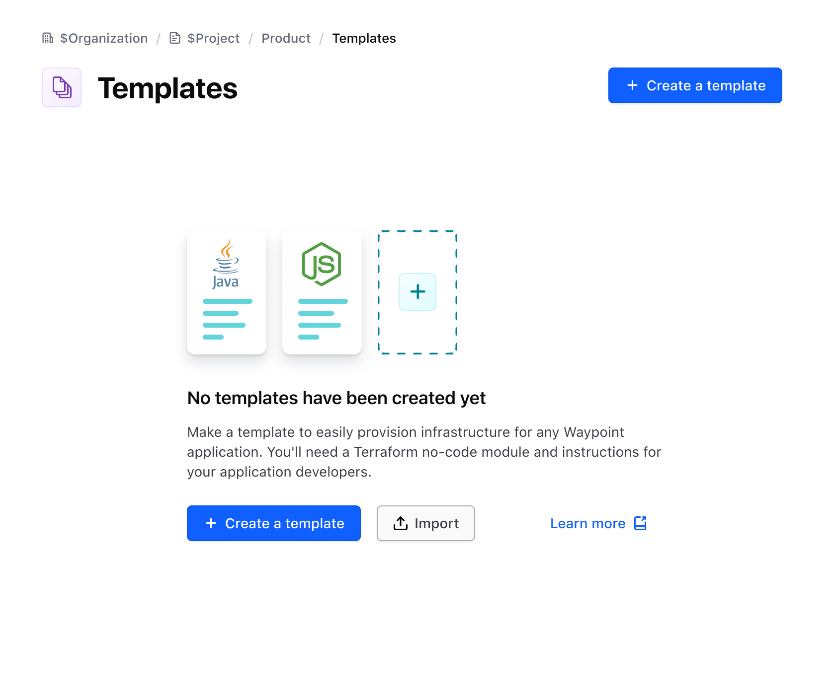
Empty state
An empty state occurs when a user has yet to create an object. Illustrations are placed using the media slot to further elevate the experience and express the purpose of the object.

How to use this component
This component intends to replace a few different simple error and empty/zero state components that exist across product UIs, while providing flexibility to adapt to additional application states. While we’re referring to these as "error state" and "empty state" this is just to help consumers relate to the components that have been replaced. Really, this component can be used to reflect any kind of application state message that is needed.
As an empty state
The item you were looking for was not found.
<Hds::ApplicationState as |A|>
  <A.Header @title="Empty state title text" />
  <A.Body @text="The item you were looking for was not found." />
</Hds::ApplicationState>
Empty state with header icon
The item you were looking for was not found.
<Hds::ApplicationState as |A|>
  <A.Header @title="Empty state title text" @icon="alert-circle" />
  <A.Body @text="The item you were looking for was not found." />
</Hds::ApplicationState>
Empty state with a footer link
The item you were looking for was not found.
<Hds::ApplicationState as |A|>
  <A.Header @title="Empty state title text" />
  <A.Body @text="The item you were looking for was not found." />
  <A.Footer as |F|>
    <F.LinkStandalone @icon="help" @text="Need Help" @href="/components/alert"
    @iconPosition="trailing" />
  </A.Footer>
</Hds::ApplicationState>
Empty state with yielded body block
<Hds::ApplicationState as |A|>
  <A.Header @title="Empty state title text" />
  <A.Body>
    <Doc::Placeholder @text="block yield" @height="100" @background="#eee" />
  </A.Body>
  <A.Footer as |F|>
    <F.LinkStandalone @icon="arrow-left" @text="Go back" @href="/" />
  </A.Footer>
</Hds::ApplicationState>
Empty state with body text
Some sentence that conveys a good message to the user
<Hds::ApplicationState as |A|>
  <A.Header @title="Empty state title text" />
  <A.Body @text="Some sentence that conveys a good message to the user" />
  <A.Footer as |F|>
    <F.LinkStandalone @icon="arrow-left" @text="Go back" @href="/" />
  </A.Footer>
</Hds::ApplicationState>
Empty state with center alignment
Some sentence that conveys a good message to the user
<Hds::ApplicationState @align="center" as |A|>
  <A.Header @title="Empty state title text" />
  <A.Body @text="Some sentence that conveys a good message to the user" />
  <A.Footer as |F|>
    <F.LinkStandalone @icon="arrow-left" @text="Go back" @href="/" />
  </A.Footer>
</Hds::ApplicationState>
Empty state with media
Some sentence that conveys a good message to the user
<Hds::ApplicationState as |A|>
  <A.Media><img src="/assets/images/avatar-bd9ab58aeb803d6e0c0001377034d99d.png" alt="portrait of a cat wearing coat and tie" /></A.Media>
  <A.Header @title="Empty state title text" />
  <A.Body @text="Some sentence that conveys a good message to the user" />
  <A.Footer as |F|>
    <F.LinkStandalone @icon="arrow-left" @text="Go back" @href="/" />
  </A.Footer>
</Hds::ApplicationState>
As an error state
To indicate that the message is an error state, add @errorCode to the [A].Header component invocation.